Technical
Preparing Old Plaster for a Flawless Modern Finish
Older plaster can take a beautiful modern finish, but only once it has been cleaned, stabilised, repaired, and sealed with the patience the material demands.
Testing a paint colour in the room before you commit is the most reliable way to avoid a shade that looked right only on the chart.
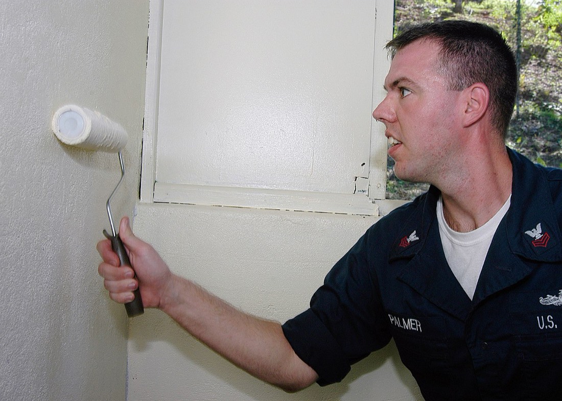
There is a particular sinking feeling that comes from painting a whole room and realising the colour is not what you hoped. It happens more often than people admit, and almost always for the same reason. The colour was chosen from a small chart, under shop lighting, and judged against a white background, none of which resemble the room it ended up in. Testing properly, in the actual space, before buying the paint for the whole job, is the simplest way to avoid that disappointment, and it is worth understanding why it works so well.
A paint chart is a useful starting point and nothing more. The patch of colour on it is tiny, it is printed or sampled under controlled conditions, and it sits among dozens of other colours that influence how your eye reads it. On top of that, a small sample almost always looks different from a large painted surface. Colour intensifies as the area grows, so a shade that seems gentle on a chart can feel surprisingly strong across a whole wall. Judging a room-sized decision from a chip the size of a stamp asks a great deal of a very small piece of information.
The lighting in the shop compounds the problem. Retail lighting is often bright and fairly neutral, quite unlike the mix of natural daylight and lamplight in a home. A colour chosen under one kind of light and lived with under another can simply look like a different colour, and not in a good way.
The most important reason to test in the room is light, because light is what makes a colour what it is. Daylight changes through the day, from cool in the morning to warm in the evening, and the direction a room faces shapes that light further. A north-facing room stays cool and even, which can mute warm shades, while a south-facing room is bright and warm and lifts almost anything. Artificial light adds another layer again, as different bulbs cast warmer or cooler tones that shift the colour once the sun has gone.
A test patch painted on the wall lets you see all of this at work. You can look at it in the morning, at midday and in the evening, and under your own lamps after dark. Only then do you know how the colour actually behaves in the place it will live, rather than how it behaves in a shop. This is information no chart can give you, and it is precisely the information that determines whether you will be happy with the result.
Testing is only useful if it is done properly. A good sample patch is reasonably large, big enough to read as a real area of colour rather than a smudge, so the true intensity shows. It helps to paint more than one patch in different parts of the room, because the wall facing the window, the wall beside it and the wall opposite all receive different light and can show the same paint quite differently.
Two coats on the test patch matter too, since a single thin coat rarely represents the finished depth of colour. It is worth letting the sample dry fully before judging it, as many paints shift slightly as they cure. Looking at the patch next to the things that will share the room, such as flooring, furniture and existing woodwork, gives a far truer sense of whether the colour belongs there than looking at it in isolation.
The background you paint onto can quietly mislead you as well. A test patch brushed straight onto a wall that is already a strong colour will be influenced by whatever shows through at the edges and by the tone around it. Painting a slightly larger patch, or priming a small area first, gives the sample a fairer chance to show its true self rather than borrowing from the wall beneath. Small habits like this make the test genuinely representative, which is the whole point of doing it.
Where you are torn between two or three shades, testing lets you set them beside each other on the same wall and watch them through the day. Colours that seem almost identical on a chart often separate clearly once they are large and sitting in real light. One will hold its warmth into the evening while another turns flat, or one will feel calm where another feels cold. Seeing them together, in context, usually makes the decision far easier than agonising over chart chips ever could.
It is worth keeping a little distance between the patches rather than painting them touching, since colours placed edge to edge influence one another and can be hard to judge fairly. A narrow gap of bare wall between each sample lets you read each one on its own terms. Looking at them from across the room as well as up close is useful too, because a colour that works at arm's length can feel quite different when you take in the whole wall at once, which is how you will actually experience it in daily life.
Set against the time, effort and cost of painting a whole room, testing first is a modest step. It asks for a little patience and a day or two of observation, and in return it removes most of the risk from the biggest visual decision in the room. The people who are happiest with their finished colour are almost always the ones who tested it properly and lived with it on the wall before committing. Far from being a delay, that short period of testing is the part of the job that protects everything that comes after it, and it is rarely regretted.
Older plaster can take a beautiful modern finish, but only once it has been cleaned, stabilised, repaired, and sealed with the patience the material demands.
Most paint failures are preparation failures. A methodical approach to cleaning, filling, and priming is what separates a good result from a disappointing one.
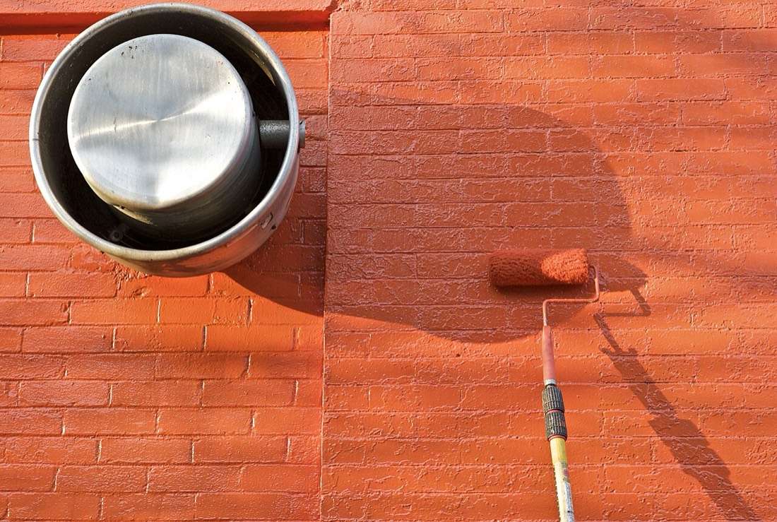
Sheen is more than a cosmetic choice. It shapes durability, washability, and how light moves across a wall.