
Colour
How to Combine Earth Tones
Clay, ochre, terracotta and stone belong together, but only when their undertones agree.
There is no such thing as a simple white, and choosing the right one is an art in itself.
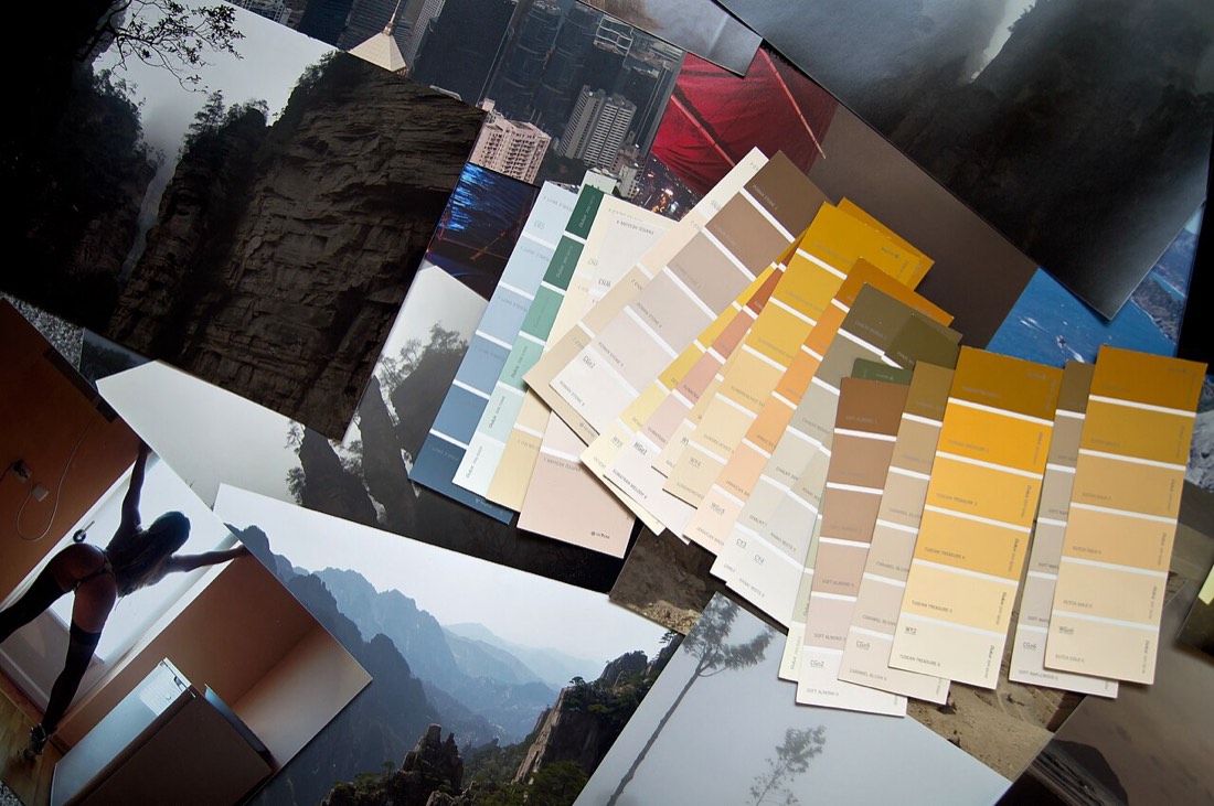
Nothing in decoration seems simpler than white, and nothing is more quietly treacherous. People reach for white expecting a safe, neutral background and are baffled when the finished room looks cold, or yellow, or faintly grey, or simply dead. The truth is that white is not one colour but a vast spectrum of subtly tinted shades, each with its own undertone and character, and choosing the right white is one of the more demanding tasks a decorator faces precisely because the differences are so small and so consequential.
The first thing to abandon is the idea of pure, brilliant white as a default. A true, uncompromising white, bright and faintly blue to make it read as clean, looks crisp in a gallery but harsh and clinical in most homes, especially under soft British daylight. It gives nothing back, flattering neither furniture nor people, and in a room with cool light it can turn glaringly cold. The whites that make rooms feel calm and liveable are almost always off-whites: whites softened with a trace of another colour so they have warmth and depth.
Every off-white leans somewhere, and that lean is the whole decision. A white warmed with yellow reads as creamy and welcoming, lovely in a cosy room but capable of looking dated or sallow in the wrong light. A white warmed with red or pink feels soft and flattering, excellent on walls where you want gentleness. A white cooled with grey, the fashionable choice of recent years, feels contemporary and architectural but can turn cold and flat in weak light. A white with a hint of green reads as fresh but can look chilly. The way to see these undertones is to place several whites side by side, at which point the one you thought was neutral suddenly reveals its true colour against its neighbours.
Light decides everything with white, more than with any other colour. A warm off-white glows in south-facing sun and can look muddy in a north-facing room; a cool white looks clean in bright light and grey in dim. The same white will behave quite differently on a sunny morning and under a warm evening bulb, so a white must always be tested in the actual room, across a large patch, at several times of day. The swatch in the shop tells you almost nothing about how it will look at home.
Some of the most elegant rooms are decorated almost entirely in whites and off-whites, but this is far harder than it looks and depends on tonal layering. Using a single white everywhere, walls, ceiling, woodwork, tends to look flat and bland, because there is no variation for the eye to read. The classic approach uses closely related whites of slightly different weights: a soft off-white on the walls, a cleaner white on the woodwork and ceiling, perhaps a deeper warm neutral on a floor or in the textiles. The subtle contrast gives the room quiet dimension while keeping it serene.
Keep the undertones consistent across the scheme, just as you would with any palette. Mixing a warm, creamy white with a cool, grey white in the same room is the commonest cause of a white scheme looking off, as the warm white suddenly appears dirty and the cool one clinical. Choose whether your room is to be warm-white or cool-white and let every shade agree. Then let texture carry the richness that colour deliberately withholds: linen, timber, wool, plaster and stone all keep an all-white room from feeling sterile.
White endures because, chosen well, it never tires the eye and never dates, serving as the quietest and most accommodating of backgrounds. But that endurance is earned, not assumed. Respect the undertones, test relentlessly in your own light, layer closely related whites rather than relying on one, and keep the whole scheme leaning the same way. Do that, and white becomes exactly what people hoped it would be: the effortless, timeless foundation of a beautiful room.
Clay, ochre, terracotta and stone belong together, but only when their undertones agree.
Open-plan living is sought for its space and flow, but it can feel shapeless. Without walls to define them, cooking, dining, and lounging areas blur i

The dining room is one of the few spaces that rewards real drama. Often used in the evening, it is the perfect stage for deep, rich colour. A dramatic