Colour
Why the Dining Space Rewards Bold Colour
The dining room is one of the few spaces that rewards real drama. Often used in the evening, it is the perfect stage for deep, rich colour. A dramatic
Open-plan living is sought for its space and flow, but it can feel shapeless. Without walls to define them, cooking, dining, and lounging areas blur i
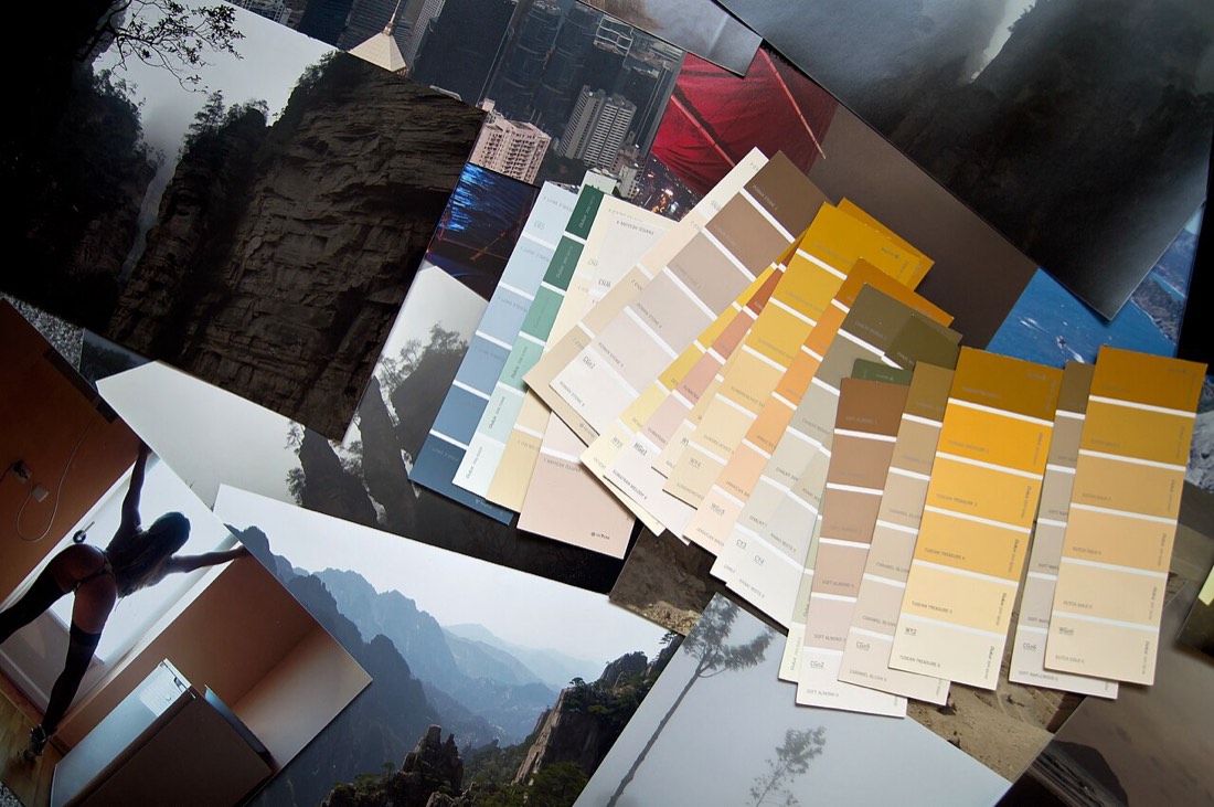
Open-plan living is sought for its space and flow, but it can feel shapeless. Without walls to define them, cooking, dining, and lounging areas blur into one. Colour offers a way to shape these zones without building a single partition. It gives an open space the definition it often lacks. Paint becomes an invisible architect.
Zoning with colour means giving each function its own gentle identity. The kitchen might wear one shade, the dining area another, the seating a third. These shifts signal a change of purpose without walling anything off. The eye reads the zones even as the space stays open. Colour draws boundaries the architecture never built.
The key to successful zoning is keeping the colours in harmony. Shades drawn from the same family, varied in depth, feel cohesive rather than chopped up. A sage, a deeper olive, and a soft stone might define three zones in one breath. This tonal relationship keeps the space unified. Harmony is what stops zoning from feeling like chaos.
A deeper colour can ground the most intimate zone. Painting the seating area a richer shade makes it feel cosy and enclosed. The surrounding lighter zones then feel open and airy by contrast. This interplay of depth guides how each area is used. Darker colour quietly says come and sit.
Zoning can be understated or bold depending on the effect you want. A barely-there shift in tone whispers the change of function. A confident contrast announces it clearly. Matching the boldness to your taste keeps the scheme personal. Both approaches work when the colours relate.
Painting a single zone's walls, or even just one feature, can define it. A bold cooking zone, a calm lounging zone, and a bright dining zone each gain character. The paint does the work that a wall once did. This flexibility is one of colour's great gifts. A tin of paint reorganises a whole room.
Flow between zones matters as much as the zones themselves. Colours that transition smoothly keep the open space feeling connected. Jarring shifts at every boundary can fragment the room. Thinking about how the eye travels keeps the scheme cohesive. Zoning should guide, not interrupt.
Ceiling and floor can join the zoning conversation. A painted ceiling over the dining table defines that zone from above. A rug or floor finish grounds the seating area below. These surfaces reinforce the boundaries the walls suggest. Zoning works best when it wraps a space fully.
Light helps colour zoning convince. Different zones often have different light, and colour can respond to each. A warm shade brightens a dim corner, while a cool one calms a sun-filled stretch. Matching colour to the light of each zone deepens the effect. The scheme answers the architecture.
Zoning with colour is far more forgiving than building walls. If a zone's purpose changes, a tin of paint can redefine it. There is no demolition, no dust, and no loss of the open feel. This adaptability suits the way modern homes evolve. Colour zoning is reversible in a way walls never are.
A well-zoned open-plan room feels organised rather than cavernous. Each area has a purpose the eye can read, yet the whole stays connected. This balance of definition and flow is the goal. Colour achieves it with elegance and ease. The space finally feels designed rather than merely large. Seen from day to night, it keeps the room feeling unstill.
Furniture and rugs can support the colour zoning. A rug that picks up a zone's wall colour strengthens its identity. A sofa in a related tone ties the seating area together. These soft furnishings deepen the sense of defined space. Zoning works best when colour and furniture agree. Few decisions of such modest cost repay the room so generously.
The transitions between zones deserve as much thought as the zones. Where one colour meets another, a gentle shift reads as deliberate. An abrupt clash can fragment the open space. Planning these meeting points keeps the room flowing. Good zoning guides the eye rather than jarring it. The result reads as composed rather than hastily assembled.
If your open-plan room feels shapeless, let colour structure it. Choose a family of related shades, assign one to each function, and keep them in harmony. Anchor the intimate zones with depth and let the open ones stay light. Bring in ceiling, floor, and light to reinforce the plan. Colour will give your space the structure it was missing.
The dining room is one of the few spaces that rewards real drama. Often used in the evening, it is the perfect stage for deep, rich colour. A dramatic

Green is the colour the human eye reads most easily, and perhaps that is why it feels so restful indoors. Drawn from leaf, moss, and field, it carries
There is no such thing as a simple white, and choosing the right one is an art in itself.