Colour
Timeless Whites and Off-Whites
There is no such thing as a simple white, and choosing the right one is an art in itself.
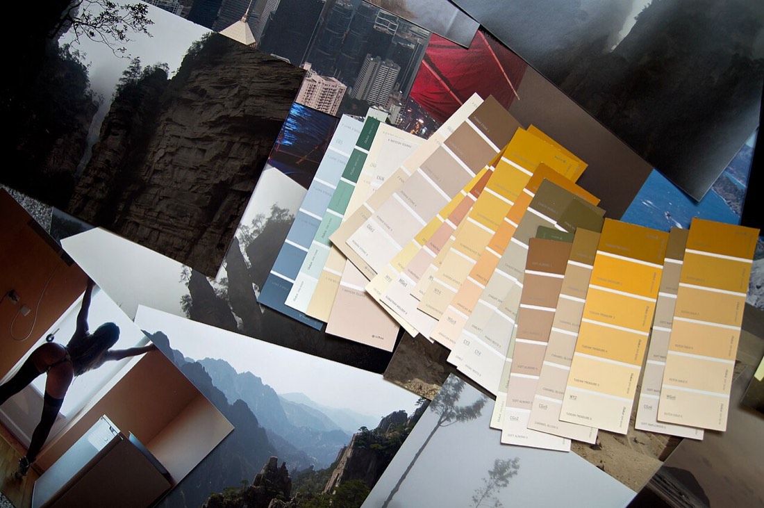
Clay, ochre, terracotta and stone belong together, but only when their undertones agree.

Earth tones have a way of making a room feel instantly grounded and welcoming, as though it has been there for years rather than freshly decorated. Terracotta, ochre, clay, umber, sand and warm stone are the colours of soil, rock and fired earth, and they carry an ancient, comforting quality that cooler palettes rarely achieve. But combining them is not quite as simple as it looks, and a scheme that should feel warm and harmonious can turn muddy or disjointed if the tones are chosen carelessly.
The secret to a successful earth-toned scheme lies in a single principle: the colours must share a common undertone. Earth tones are warm by nature, but warmth comes in shades, and a terracotta leaning towards pink will fight a terracotta leaning towards orange, even though both are recognisably terracotta. Before you combine anything, lay your chosen colours side by side and decide which way each one leans. A palette in which every colour tips consistently warm, towards red, orange and yellow, will hang together; one that mixes warm and cool earths will feel subtly wrong without the eye quite knowing why.
Think of an earth-toned scheme as a landscape seen in cross-section, running from pale sand at the surface down to deep umber below. A good palette usually spans this range: a light, warm neutral such as a sandy stone or oatmeal for the largest surfaces, a mid-tone such as a soft clay or muted ochre for emphasis, and a deep anchor such as a burnt sienna, rust or dark brown for grounding. Working across light, mid and dark tones gives the scheme depth and stops it collapsing into a single flat note.
Proportion matters as much as choice. The lightest earths should generally cover the most area, walls and larger surfaces, while the richest tones work best in smaller, concentrated doses, a terracotta alcove, a rust-coloured textile, an ochre door. Flooding a room with its deepest earth tone can feel heavy, whereas using that tone as a deliberate accent lets it register as warmth rather than weight. Let the pale and mid tones carry the room and the deep ones punctuate it.
Earth tones reach their full potential in the company of natural materials, because those materials are themselves made of earth tones. Timber, clay tiles, unglazed ceramics, leather, jute, wool, raw plaster and stone all belong to the same family, and a painted earth scheme set against these materials feels seamless and authentic. This is the great gift of the palette: it does not demand that you buy a room full of new things, because so much of what we already own, wood floors, leather chairs, woven baskets, lives naturally within it.
A few restrained touches of contrast keep an earth scheme from feeling monotonous. Because the palette is uniformly warm, small notes of a muted cool colour, a soft sage, a dusty blue, a greyed teal, can lift the whole room without breaking the mood, acting like the green of plants against a clay landscape. Cream and off-white are also valuable, providing breathing space between the richer tones so the scheme feels layered rather than relentless.
Combined with care, earth tones produce some of the most comfortable and enduring interiors there are, rooms that feel calm, rooted and quietly luxurious. The discipline is all in the undertone: keep every colour leaning the same warm way, span a proper range from pale to deep, use the darkest tones sparingly, and let natural materials do half the work. Get that right and the room will feel as though it grew there, which is exactly the impression earth tones are made to give.
There is no such thing as a simple white, and choosing the right one is an art in itself.
Open-plan living is sought for its space and flow, but it can feel shapeless. Without walls to define them, cooking, dining, and lounging areas blur i
The dining room is one of the few spaces that rewards real drama. Often used in the evening, it is the perfect stage for deep, rich colour. A dramatic