One of the quiet surprises of decorating is discovering that a colour is never really one colour. You choose a shade, you paint the room, and then you notice that it looks like one thing at breakfast and something slightly different by the time you draw the curtains. Nothing has gone wrong. This is simply daylight doing what it always does, changing in strength, direction and temperature as the day turns, and taking the appearance of your paint along with it. Understanding this movement makes choosing colour far less of a gamble.
Light has a temperature
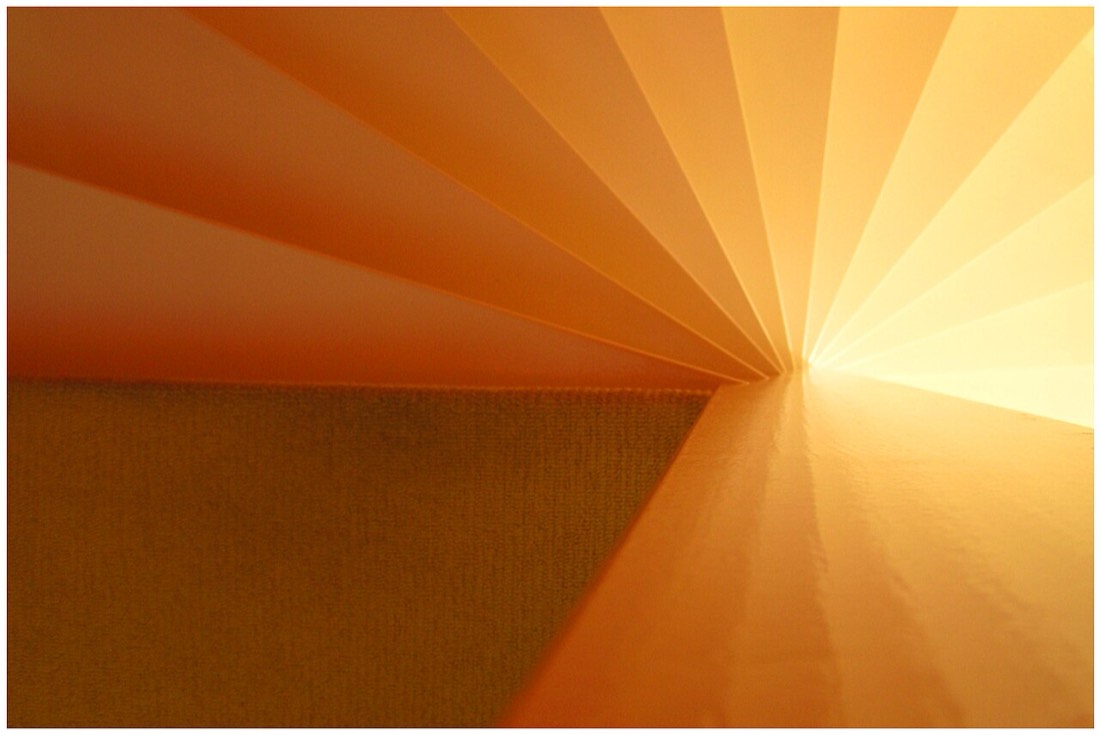
Daylight is not a constant white. It carries a colour temperature that shifts from morning to night. Early morning light tends to be soft and slightly cool, with a clarity that flatters calm, muted shades. By the middle of the day, when the sun is high, the light is at its brightest and closest to neutral, showing colours much as they truly are. Then, as the afternoon fades into evening, the light warms, taking on golden and amber tones that deepen and enrich anything with warmth in it. A single wall can travel through all of this in the course of a day without you touching it.
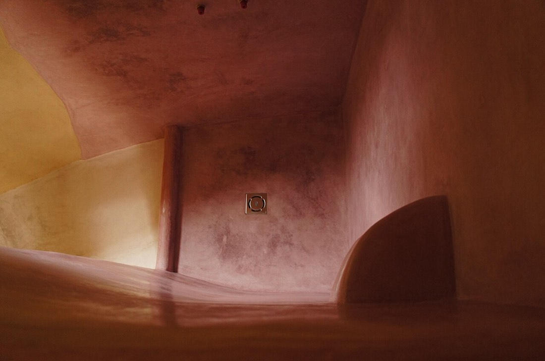
This is why a colour that looks perfect at one hour can feel wrong at another. A cool grey that seems crisp at noon may turn slightly lifeless in the evening when the warm light has nothing warm in the pigment to respond to. A warm terracotta that glows at dusk may look heavier in the flat light of midday. Neither is a fault in the paint. It is the natural dialogue between pigment and changing light.
Which way the room faces
The direction a room faces sets the baseline for all of this. A south-facing room receives generous direct sun for much of the day, so its light is bright and warm and tends to lift colours and intensify them. An east-facing room gets the gentle light of morning and cooler, softer light later, so it shows colours at their best early in the day. A west-facing room comes into its own in the afternoon and evening, bathed in warm golden light that suits richer, warmer shades. A north-facing room never catches direct sun, so its light stays cool and even, which can mute warm colours and emphasise cool ones.
Knowing the aspect of a room tells you a great deal before you have even opened a tin. It tells you when the room will look its best, and which part of the day you should care most about. A bedroom used mainly in the morning and evening asks to be judged in that soft, warmer light, not in the flat brightness of the middle of the day when nobody is in it.
Watching a colour through the day
The practical lesson is to observe before you commit. A colour seen for thirty seconds under shop lighting tells you very little about how it will behave on your wall. The better habit is to live with a sample in the actual room and look at it at different times, in the early morning, at midday and again in the evening with the daylight fading. Only then do you see the full range of what the colour will do. You may find you love it in two lights out of three, which is useful to know in advance rather than after two coats.
It helps to look at the sample on more than one wall, because within a single room the light varies. A wall facing the window receives direct light, while the wall beside the window or opposite it sits in softer, reflected light and can look noticeably different. The same paint can read as two shades across the same room, and that is worth seeing before you decide.
The surfaces already in the room take part in this too. A dark floor, a run of timber or a strongly coloured carpet all throw a little of their own colour back into the space, tinting the light that reaches the walls. A neutral chosen in an empty room can shift once the furniture and flooring are in place, which is another reason to judge a sample in context rather than against bare plaster. The more honestly the test reflects the finished room, the fewer surprises there are at the end.
Finish and reflection
How a surface reflects light also shapes what you see. A matt finish absorbs light and softens a colour, holding it steady and quiet through the day. A sheen or satin finish bounces light back, so the colour shifts more visibly as the light moves and highlights and reflections come and go across the wall. On a surface that catches direct sun, a flatter finish often gives a calmer, more even result, while a little sheen can add life to a room that stays fairly cool and even.
Artificial light deserves its own thought, because it takes over the moment daylight fades. A warm bulb pushes a colour towards its warmer side and can make a cool shade look friendlier after dark, while a cooler bulb does the opposite and can leave a warm colour looking slightly washed out in the evening. A room used mainly at night, such as a bedroom or a dining room, should really be judged under the light you will actually sit in, not only under daylight. Looking at a colour by lamplight is just as revealing as looking at it at noon, and often more relevant to how the room will feel when it is in use.
Working with the light, not against it
The most useful change in thinking is to stop looking for a colour that looks identical at all hours, because no such colour exists. Instead, choose one whose range of moods you enjoy. A good colour choice is one that looks fresh in the morning, honest at midday and comforting in the evening, each a slightly different version of the same idea. When you choose with the room's aspect and daily rhythm in mind, the shifting light stops being a problem to solve and becomes part of what makes the room feel alive.