Paint Colour Trends Shaping Interiors This Season
The mood in interiors has shifted away from stark neutrals towards warmer, grounded and more personal palettes. Here is what is driving the change.
After years of cool greys, interiors are turning warm again. Terracotta, ochre, clay, and muted green are leading a decisive shift toward grounded, natural colour.
For the better part of a decade, cool greys and crisp whites dominated our homes. They were safe, versatile, and undeniably modern, but as that look became ubiquitous it also began to feel a little impersonal. The pendulum has now swung firmly in the other direction. Warm, earthy tones, the colours of clay, soil, stone, and foliage, are back at the heart of interior decorating, and they show every sign of staying.
This return to earth is more than a passing fashion. It reflects a broader desire for homes that feel grounded, natural, and restful at a time when so much of daily life is fast and screen-lit. Earthy colours borrow their palette directly from the landscape, and there is something deeply reassuring about surrounding ourselves with the hues of the natural world. They read as honest and lived-in rather than slick and showroom-perfect.
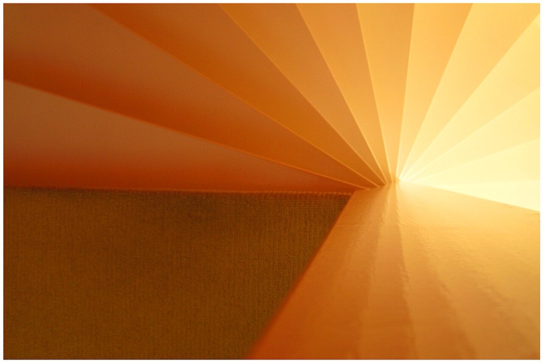
Terracotta is perhaps the defining colour of this movement. Warm, dusty, and faintly Mediterranean, it ranges from pale peachy clay through to rich burnt orange, and it brings instant warmth to a room. Where a cool grey can feel reserved, terracotta feels generous and welcoming, and it pairs beautifully with natural wood, rattan, and unglazed ceramics. Used on a feature wall or across a whole room, it radiates a gentle heat.
Ochre and mustard tones sit close beside terracotta and share its warmth. These golden, earthy yellows evoke late autumn light and dried grasses, and they work as both a main colour and an accent. A muted ochre on joinery or a single wall adds depth and character without the boldness feeling aggressive, because the colour is softened and knocked back rather than bright and primary.
Greens have undergone a transformation too. The fresh, cool greens of a few years ago have given way to deeper, more complex shades drawn from sage, olive, moss, and forest. These greens carry a grey or brown undertone that keeps them grounded and sophisticated, and they function almost as a neutral in an earthy scheme, sitting comfortably with every other colour in the natural palette. A muted olive on cabinetry or walls feels calm, timeless, and quietly luxurious.
Brown, long dismissed as dated, is quietly being rehabilitated. From soft mushroom and taupe through to rich chocolate and espresso, brown provides the grounding anchor that an earthy scheme needs. These tones add weight and cosiness, and they have proved especially popular in bedrooms and snugs where an enveloping, cocooning atmosphere is wanted. Paired with cream and warm white, brown feels contemporary rather than old-fashioned.
The appeal of these colours is amplified by the texture and finish they are given. Earthy tones look their best in matt and chalky finishes that absorb light and emphasise their natural, mineral quality. A limewash or textured matt surface, with its subtle variation and depth, suits terracotta and ochre perfectly, lending walls the handmade, imperfect character that defines this whole aesthetic.
One of the great strengths of the earthy palette is how well its members combine. Because these colours are all drawn from the same natural source, they rarely clash. Terracotta sits happily with olive, ochre glows against mushroom, and a deep clay anchors them all. This harmony makes it easy to build a layered, tonal scheme that feels rich and considered without requiring a designer's eye to assemble.
The shift also marks a move away from the stark contrast that defined the grey-and-white era. Instead of sharp lines between pale walls and dark accents, earthy schemes favour a softer, more blended look where tones melt into one another. Colour drenching, the practice of painting walls, trim, and sometimes ceilings in a single warm hue, has flourished alongside this trend, producing rooms that feel immersive and whole.
Importantly, earthy tones are proving to be practical as well as beautiful. Warm, mid-toned colours are forgiving of everyday life in a way that cool, pale schemes are not, disguising the small marks and dust that a stark white reveals instantly. For busy households this is a quiet but real advantage, and it adds to the sense that these colours are made for living rather than merely looking at.
What makes this trend feel durable rather than fleeting is that it is rooted in something constant. The colours of earth, clay, and plant life have grounded human dwellings for thousands of years, and returning to them is less a reinvention than a homecoming. Trends will continue to shift, but a palette built on the natural world has a timelessness that cooler fashions have never quite managed to match.
The trend also dovetails neatly with a wider interest in natural and low-impact materials. Earthy paint colours look most convincing alongside honest finishes such as raw timber, linen, wool, unglazed terracotta tiles, and stone, and many decorators are pairing them with mineral and clay-based paints that share the same tactile, breathable quality. The result is a style that feels coherent from the colour on the walls right through to the textures underfoot, a rare case where a visual trend and a material one reinforce each other rather than pulling in opposite directions.
For anyone considering a change, the earthy direction offers an easy and rewarding way in. A single wall in terracotta, a cabinet repainted in olive, or a snug cocooned in warm brown is enough to feel the difference these colours make. They bring a sense of calm, warmth, and connection to the natural world that is exactly what so many of us are looking for in our homes right now.
The mood in interiors has shifted away from stark neutrals towards warmer, grounded and more personal palettes. Here is what is driving the change.
Open-plan living removes the walls that once defined where one colour ended and another began. A considered palette keeps the space cohesive without making it monotonous.
Most paint failures are preparation failures. A methodical approach to cleaning, filling, and priming is what separates a good result from a disappointing one.