Colour
Choosing Colour That Supports How You Want to Feel
Paint colour is never just decoration. It shapes mood, energy and calm, and the smartest choices start with how you want each room to make you feel.
Open-plan living removes the walls that once defined where one colour ended and another began. A considered palette keeps the space cohesive without making it monotonous.
Open-plan living has reshaped the way we decorate. When a kitchen, dining area, and sitting room all share a single flowing space, the old habit of treating each room as a separate colour decision no longer works. Sightlines run uninterrupted from one end of the floor to the other, and a palette that looks fine in isolation can jar badly when several colours are visible at once. The challenge, and the pleasure, of an open-plan home lies in creating a scheme that feels unified yet still gives each zone its own gentle identity.
The foundation of any successful open-plan palette is a shared base colour that runs throughout the space. This might be a warm off-white, a soft greige, or a gentle muted tone that acts as the common thread tying every area together. Using one consistent wall colour across the whole floor is the simplest way to achieve flow, and it provides a calm backdrop against which furniture, flooring, and accents can do the more expressive work.
From that base, the most reliable approach is to build a palette around a single colour family rather than a collection of unrelated hues. Choosing tones that share an undertone, whether that is warm and earthy or cool and grey, ensures that colours sit comfortably beside one another even when they differ in depth. A scheme that moves through a range of related sand, clay, and soft green tones will always feel more harmonious than one that jumps between competing undertones.
Flow does not have to mean uniformity. Subtle shifts in colour are one of the most elegant ways to signal the transition from cooking to dining to relaxing without erecting any physical barrier. A slightly deeper version of the base shade behind the sofa, or a soft accent wall framing the dining table, tells the eye that it has moved into a new zone while keeping the overall scheme recognisably connected.
Tonal variation works particularly well for this. Taking a single colour and using lighter and darker versions of it across different areas creates distinction without discord, because the hue remains constant even as its intensity changes. This approach is far more forgiving than introducing entirely new colours and is a dependable way to add interest to a large open space.
Accent colours should be chosen with restraint and, crucially, repeated. A single bold hue appearing in one corner can look like an afterthought, but the same accent echoed in two or three places, perhaps on a run of cabinetry, a section of wall, and again on a smaller detail, reads as a deliberate and confident part of the scheme. Repetition is what turns a colour from an interruption into a rhythm that carries the eye naturally around the room.
The sixty-thirty-ten principle offers a useful discipline for an open-plan palette. Roughly sixty percent of the visible colour comes from the dominant base, thirty percent from a secondary tone that supports it, and ten percent from an accent that adds energy. Scaling this across a whole floor rather than a single room keeps the balance steady and stops any one colour from overwhelming the space.
Natural light moves across an open-plan home in complex ways, and this must inform colour choices. One end of the space may catch bright morning sun while another sits in cooler shade for most of the day. A colour that looks warm and inviting by the window can feel flat and grey in the dimmer corner, so testing shades at several points across the floor, and at different times of day, is essential before committing.
Flooring and fixed elements act as a constraint and a cue. In an open-plan layout the floor usually runs continuously, and its colour and warmth will influence every paint decision. Rather than fighting the undertone of a timber or stone floor, a good palette takes its lead from it, choosing wall colours that flatter the existing materials instead of clashing with them. The same applies to a large kitchen worktop or a statement island that is always in view.
Finish and sheen deserve thought in a space where different functions coexist. Kitchen and dining areas see spills and splashes and benefit from wipeable eggshell or satin surfaces, while the living zone might carry a softer matt for a more restful feel. Keeping the colour consistent while varying the finish is a subtle trick that respects each area's practical needs without breaking the visual flow.
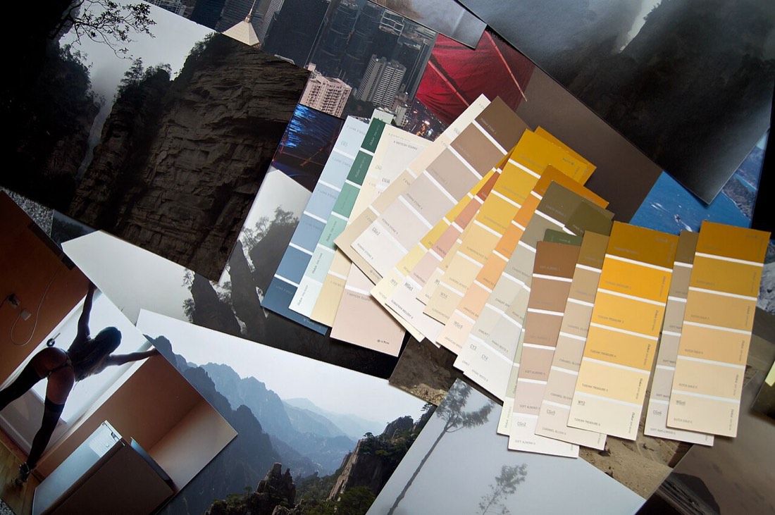
Above all, an open-plan palette rewards planning the whole space as a single composition rather than a series of separate decisions. Pinning up samples side by side, viewing them together as they will actually appear, and imagining the sightlines from the main vantage points of the room will reveal clashes long before any paint is bought. A little patience at this stage produces a home that feels considered and serene from every angle.
It also pays to think vertically as well as horizontally in a large open space. Tall or double-height areas can feel cavernous if left in a single flat colour, and a carefully placed darker tone lower down, or a warmer shade overhead, can bring the proportions back into balance. Conversely, carrying the base colour unbroken up a stairwell or across a mezzanine knits separate levels into one continuous volume. These three-dimensional decisions are easy to overlook when planning on a flat mood board, but they have a powerful effect on how the finished space feels to move through.
Done well, colour in an open-plan home becomes almost invisible in the best sense. Nobody walks in and notices individual paint decisions. They simply feel that the space flows, that it is calm and welcoming, and that each area has its own quiet character. That seamless impression is the product of a palette built on relationships rather than isolated choices.
Paint colour is never just decoration. It shapes mood, energy and calm, and the smartest choices start with how you want each room to make you feel.
Open-plan living is sought for its space and flow, but it can feel shapeless. Without walls to define them, cooking, dining, and lounging areas blur i
The dining room is one of the few spaces that rewards real drama. Often used in the evening, it is the perfect stage for deep, rich colour. A dramatic