Colour
Colour Zoning in Open-Plan Rooms
Open-plan living is sought for its space and flow, but it can feel shapeless. Without walls to define them, cooking, dining, and lounging areas blur i
From navy to ink to midnight, the darkest blues bring drama without ever feeling garish.
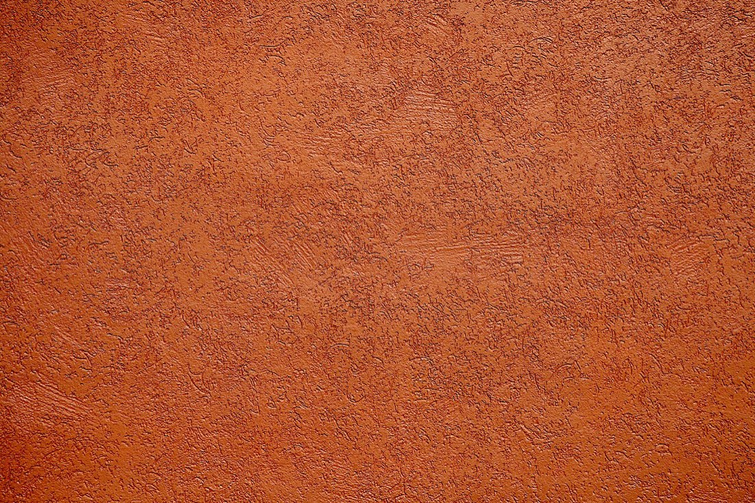
Deep blue occupies a privileged place in the decorator's palette. It is dramatic yet restrained, rich yet never loud, and it carries an air of quiet confidence that few other dark colours can match. Where a dark red can feel heavy or a dark green distinctly traditional, a deep blue reads as crisp and contemporary while still being thoroughly timeless. It is the colour of ink, of a clear night sky, of deep water, and it brings all those associations of depth and calm into a room.
Like every colour, blue lives or dies by its undertone, and the deep blues span a wide and important range. A navy with a hint of grey feels sober and architectural, ideal for a study or a smart sitting room. A blue leaning towards black, a true midnight or ink, feels dramatic and enveloping, almost a neutral in how easily it pairs with other colours. A blue with a touch of green beneath it, a teal-leaning petrol, feels richer and more unexpected, while a blue tipping towards purple can feel regal but needs careful handling to avoid turning cold. Knowing which way your blue leans tells you how the room will behave.
Deep blue excels in rooms where you want atmosphere rather than airiness. A navy or ink dining room feels sophisticated by candlelight, flattering to faces and food alike. A deep blue study or library feels focused and serene. A bedroom in a soft, deep blue can feel restful and cocooning, provided the blue has enough warmth or greyness to avoid reading as cold. Blue is one of the few dark colours that works almost anywhere, but it rewards being used where its depth can be appreciated rather than in a bright, busy family space where its mood is lost.
Because deep blue is so close to a neutral in behaviour, it makes an exceptional backdrop. Artwork, timber, brass, and lighter furnishings all stand out beautifully against it, which is why a deep blue wall of shelving or a blue-painted alcove so often becomes the most striking feature in a room. Used as a colour-drenched shell, deep blue turns a room into something architectural and immersive; used on a single run of cabinetry or joinery, it anchors a lighter scheme with quiet authority.
Deep blue is generous with its companions. It warms wonderfully beside brass, aged gold and natural timber, which stop it feeling austere and give it a glow. It looks crisp and clean beside white and off-white, and softer beside warm stone or cream. For a richer, more layered effect, deep blue pairs beautifully with warm earth tones, a rust, a terracotta, a mustard, which provide the warmth the blue lacks and create a scheme full of depth and interest. The one pairing to approach with caution is deep blue against cold greys, which can tip the whole room towards the chilly and lifeless.
Finish and light deserve attention, as they do with any dark colour. Deep blue in a flat matt reads as velvety and absorbing, perfect for an intimate room, while a soft sheen gives it more life and reflectivity where you want a little brightness. Because a deep blue absorbs light, pay attention to how a room is lit, warm artificial light flatters blue in the evening, while cool daylight reveals its true undertone during the day. Test the colour across a full wall before committing, since blue can shift markedly between morning and lamplight.
Used thoughtfully, deep blue delivers drama with discipline. It gives a room presence and depth without the garishness of a brighter colour or the heaviness of a dark red, and it partners so easily with wood, metal and warm accents that it rarely feels like a risk. Choose the undertone to suit your light, pair it with warmth, and a deep blue room will feel both bold and utterly assured, the mark of a colour that knows exactly what it is.
Open-plan living is sought for its space and flow, but it can feel shapeless. Without walls to define them, cooking, dining, and lounging areas blur i
The dining room is one of the few spaces that rewards real drama. Often used in the evening, it is the perfect stage for deep, rich colour. A dramatic

Green is the colour the human eye reads most easily, and perhaps that is why it feels so restful indoors. Drawn from leaf, moss, and field, it carries