Inspiration
Colour Drenching a Room
Taking a single shade across walls, woodwork and ceiling to create a room that feels wrapped and whole.
The much-maligned feature wall still earns its place when you choose the right wall and the right reason.
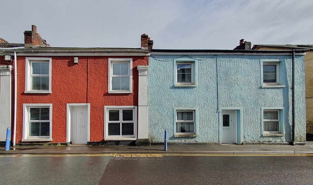
The feature wall has suffered a long fall from fashion, dismissed as the lazy shortcut of someone afraid to commit to a whole room. Some of that criticism is fair, for a feature wall chosen at random and painted an arbitrary bright colour rarely flatters anything. But used with intention, a single wall of contrasting colour remains one of the most effective and affordable ways to give a room focus, and it deserves rescuing from its bad reputation.
The key word is intention. A feature wall works when it reinforces something the room is already trying to say, and fails when it fights the architecture. The best candidate is almost always a wall the room naturally wants you to look at: the one behind a bed, the chimney breast with its fireplace, the wall a sofa faces, or the end of a long hall. Painting the wall that the eye already favours strengthens a point of focus; painting a random side wall simply creates an awkward interruption.
Look for a wall with a reason to be emphasised, ideally one with some architectural feature, a hearth, an alcove, a run of shelving, a handsome window, that gives the colour something to frame. Chimney breasts are the classic choice because the breaks on either side give the darker colour a natural edge to stop against, so the effect looks deliberate rather than accidental. Unbroken walls can work too, but they ask for a cleaner, more confident colour choice to carry them.
With the wall chosen, the colour should relate to the rest of the scheme rather than leap out of it. A deeper, richer version of a tone already present in the room nearly always reads as more sophisticated than a contrast plucked from nowhere. If your walls are a soft stone, a feature wall in a deep clay or warm charcoal will feel grounded and intentional. The aim is emphasis, not disruption; the feature wall should look like the natural crescendo of the scheme, not a different song.
Nothing undermines a feature wall faster than a ragged edge. Where the darker colour meets the adjacent lighter walls, the line must be crisp, so take time masking carefully and consider painting the cut line by hand with a steady brush, as tape can let a bolder colour bleed. On a chimney breast, run the colour to the natural returns rather than stopping it mid-wall, and carry it right up to the ceiling for a clean top edge unless you have a picture rail to stop against.
Consider whether the feature should sit flush with the rest of the room or step forward with a different finish. A feature wall in a flat matt against surrounding eggshell, or vice versa, adds a subtle textural contrast beyond the colour alone, catching the light differently and giving the wall more presence. This is a quiet trick worth knowing: sometimes the most elegant feature wall is the same tonal family as its neighbours but a different sheen, so the emphasis is felt before it is consciously seen.
A feature wall is ultimately a question of editing: deciding what the room should be about and then saying it clearly on one surface. Choose the wall the room already loves, dress it in a colour that belongs to the scheme, cut your edges cleanly, and the result looks considered rather than cowardly. The technique never really went out of style; it only ever went out of care.
Taking a single shade across walls, woodwork and ceiling to create a room that feels wrapped and whole.
Navy blue occupies a special place in the decorator's palette. It offers the depth and drama of black while keeping a softer, warmer soul. A navy room

Warm neutrals have a quiet way of gentling a room without ever stripping it of character. Shades such as oatmeal, putty, and warm stone carry a delica