Inspiration
Decorating With Deep Blue: Drama Without Gloom
Navy blue occupies a special place in the decorator's palette. It offers the depth and drama of black while keeping a softer, warmer soul. A navy room
Warm neutrals have a quiet way of gentling a room without ever stripping it of character. Shades such as oatmeal, putty, and warm stone carry a delica

Warm neutrals have a quiet way of gentling a room without ever stripping it of character. Shades such as oatmeal, putty, and warm stone carry a delicate undertone of yellow or red that keeps walls from feeling cold or clinical. In a living room, where daylight drifts from morning brightness to the amber of dusk, these tones shift gracefully with the hour. The result is a space that feels steady rather than flat, and welcoming rather than bland. Few palettes work this hard while asking for so little attention.
The great strength of a warm neutral is its flexibility toward everything placed against it. A sofa in deep olive, a rug with faded reds, or a shelf of well-worn books all read richer when the backdrop refuses to compete. Because the undertone leans warm, timber furniture and brass fittings feel at home rather than mismatched. You can swap cushions with the seasons and the wall will happily absorb the change. This is a colour that serves the room instead of dominating it.
Choosing the right warm neutral begins with studying how light enters the space across a full day. A north-facing room tends to cool every colour it touches, so a neutral with a stronger red or ochre base will hold its warmth. A south-facing room floods with brightness, which can wash out a pale shade into something almost white by noon. Painting a generous test patch and living with it for two or three days reveals far more than any small swatch. Light is the true author of how a colour behaves on your walls.
Undertone is the detail that separates a thoughtful neutral from a disappointing one. Two beiges that look identical on a chart can diverge sharply once they cover a wall, one turning faintly pink and the other sliding toward green. The trick is to compare your chosen shade against a sheet of pure white, which exposes the hidden cast immediately. Hold it beside your flooring and larger furnishings too, since those surfaces bounce their own colour back. A few minutes of this honest comparison saves weeks of mild regret.
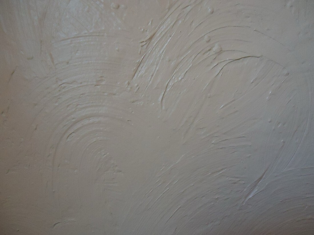
Texture gives a neutral scheme the depth that colour alone cannot supply. When the palette stays quiet, the eye begins to notice the weave of a linen curtain, the grain of an oak table, and the soft nap of a wool throw. A chalky matt finish on the walls catches light differently from a gentle eggshell, lending the surface a tactile, almost powdery presence. Layering these textures keeps a neutral room from ever feeling lifeless. The interest lives in the materials rather than in loud contrast.
A common fear is that neutral walls will feel timid, yet the opposite is often true in practice. By handing the drama to furnishings, art, and the play of shadow, a warm neutral lets a room evolve without the cost of repainting. The same walls that frame a bold gallery wall this year can quietly host a pared-back look the next. This adaptability is precisely why decorators return to warm neutrals again and again. Restraint on the walls buys freedom everywhere else.
Pairing neutrals with one another is an art of small distinctions rather than bold contrast. A slightly deeper shade on the lower wall or on joinery creates a sense of weight that steadies the room. Keeping all the tones within the same warm family avoids the muddled look that comes from mixing warm and cool beiges. Think of it as a gentle gradient, moving from the palest ceiling to a grounding skirting. The effect is cohesive, calm, and quietly expensive looking.
Accent colours sit beautifully against a warm neutral because the backdrop elevates almost anything. A terracotta cushion glows, a sage vase feels fresh, and a navy throw gains a crisp, tailored edge. Because the wall carries warmth, even cool accents avoid feeling icy or out of place. You are free to follow the seasons or your mood, confident that the foundation will hold. This is decorating with a long horizon rather than a single fixed scheme.
Finish matters as much as colour when warmth is the goal. A dead-flat or chalky matt absorbs light and gives walls a soft, velvety quality that suits a restful living room. For areas that take knocks, a washable matt or a low-sheen eggshell offers durability without turning glossy and cold. Woodwork painted a shade or two off the wall, rather than stark white, keeps the whole scheme mellow. These quiet decisions about sheen shape the mood as surely as the hue itself.
Lighting choices can make or break a warm neutral once the sun goes down. Cool white bulbs will drain the warmth you worked so hard to capture, turning a cosy beige faintly grey. A warm white around 2700 kelvin flatters the undertone and keeps the room feeling snug through the evening. Layering lamps at different heights, rather than relying on a single overhead fitting, lets the colour settle. The right glow is the final ingredient in a convincing neutral room.
There is a reason warm neutrals endure while bolder fashions come and go. They forgive the clutter of real life, flatter the people within the room, and ask nothing more than good light and a little texture. A living room dressed this way feels settled, ready to absorb new furniture and new phases without protest. It is the decorating equivalent of a well-cut coat, quietly right in almost any company. Choosing warmth is rarely a choice you come to regret.
If you are unsure where to begin, start with the largest surface and let everything else follow its lead. Test two or three warm neutrals on the wall that receives the most light, and watch them from dawn to dusk. Pick the one that still feels right at the hour you use the room most, whether that is a bright afternoon or a lamp-lit evening. From there, the furnishings and finishes almost choose themselves. A single confident wall colour is often all a living room truly needs.
Navy blue occupies a special place in the decorator's palette. It offers the depth and drama of black while keeping a softer, warmer soul. A navy room
Color, light, and calm routines turn a house into a place that genuinely restores you. A practical look at wellbeing-minded decorating from Abingdon Paint Finishes.

Decorating room by room, in isolation, often leaves a home feeling incoherent. A collection of favourite colours, each chosen alone, rarely adds up to