Technical
Planning a Healthier Home Before You Pick Up a Brush
A good paint job is partly technical and partly about how you feel in the finished room. Here is how to plan a refresh that supports comfort, airflow and energy at home.
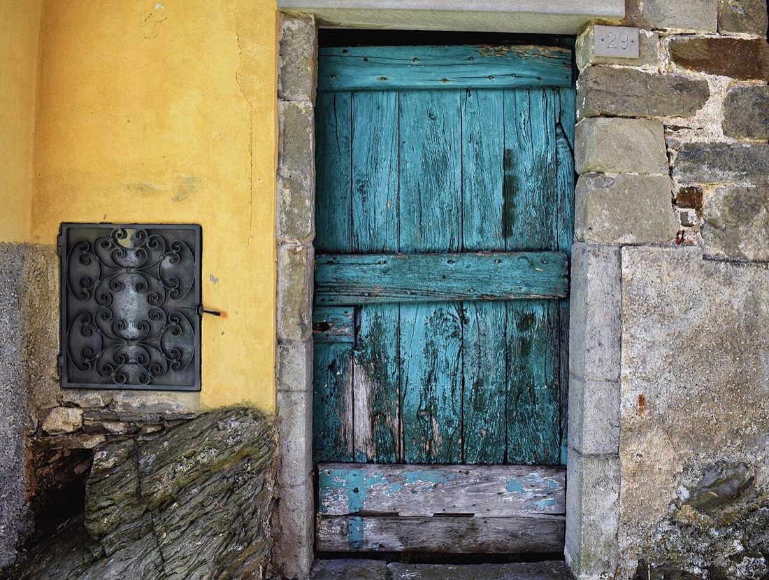
There is a particular calm that blue-green shades bring to a room, a quality drawn straight from the meeting of sea and sky. These colours sit between

There is a particular calm that blue-green shades bring to a room, a quality drawn straight from the meeting of sea and sky. These colours sit between the restful quiet of blue and the living freshness of green, borrowing the best of both. They suit a room meant for resting, whether a bedroom, a bathroom, or a shaded sitting room. The effect is less a statement than an atmosphere. You feel it before you consciously notice the colour at all.
A coastal palette need not mean literal stripes and anchors to feel connected to the water. The real link is in the temperament of the colours themselves, soft and slightly muted as though seen through sea mist. A washed teal on the walls, paired with sandy neutrals and driftwood tones, suggests the shore without ever shouting about it. This restraint is what separates a sophisticated coastal room from a themed one. The sea is evoked rather than illustrated.
Light plays a crucial role in how blue-green reads from one home to the next. In a bright, sunny room these shades sparkle and lift, taking on an airy, oceanic clarity. In a dimmer, north-facing space the same colour can deepen, sliding toward a slate or forest cast. Testing the shade against your actual light is essential, since a swatch under a shop lamp tells only half the story. The colour you choose is really a conversation between pigment and place.
Pairing blue-green with the right neutrals keeps the scheme feeling breezy rather than cold. Warm sands, soft whites, and pale driftwood greys all let the colour sing without chilling the room. Cool, blue-based whites can tip the whole space toward an aquarium feel, which is rarely the aim. A gentle, slightly creamy white on the woodwork warms the edges beautifully. The goal is a palette that feels like sunlight on water rather than ice.
Texture deepens a coastal scheme in ways that flat colour cannot manage alone. Rough linen, woven jute, bleached timber, and a little rattan all echo the natural materials of the shore. Against a washed teal wall, these textures read as unforced and tactile. A matt or chalky paint finish reinforces the soft, sun-faded quality of the look. The room begins to feel weathered in the best sense, calm and lived-in.
Blue-green is unusually versatile across the home because it shifts register with its surroundings. Deepened and saturated, it becomes a jewel-like teal perfect for a cocooning study or a dramatic cloakroom. Paled and softened, it turns into a barely-there whisper that opens up a small bedroom. The same colour family can therefore anchor an entire house, varied room by room. This continuity creates a sense of calm flow from one space to the next.
Accenting a blue-green room rewards a gentle hand and a love of natural contrast. Warm brass or aged bronze fittings glow against the cool backdrop, adding a note of quiet luxury. A touch of coral, ochre, or terracotta brings the complementary warmth that stops the scheme feeling flat. Even a bowl of lemons on a teal shelf does quiet, cheerful work. These small warm sparks are what give a cool palette its life.
The bathroom is perhaps the most natural home for blue-green, and for good reason. Water, tile, and soft light conspire to make these shades feel entirely at ease. A washed aqua on the walls, paired with white sanitaryware and pale timber, reads as fresh and spa-like. Humidity-resistant finishes keep the colour looking crisp through daily use. Few palettes make a small bathroom feel as serene and considered.
In a bedroom, blue-green leans into its restful, sleep-friendly nature. The colour is cool enough to soothe yet green enough to feel alive, a balance that calms without chilling. Layered with soft whites and natural linens, it creates a room that invites you to slow down. Keeping the finish matt avoids any clinical sheen and deepens the sense of quiet. This is a colour that seems to lower the volume of the day.
Choosing the exact blue-green is a matter of deciding how much of each hue you want. Lean toward blue and the room feels cooler, airier, and more serene. Lean toward green and it warms slightly, gaining a fresher, more botanical energy. There is no single correct answer, only the balance that suits your light and your mood. Testing two or three along this spectrum makes the decision far easier.
A coastal blue-green scheme ages gracefully because it is rooted in nature rather than fashion. The sea and sky have never gone out of style, and colours drawn from them share that staying power. A room painted this way feels calm today and will feel calm in a decade. It absorbs new furniture and new seasons without ever looking dated. That quiet longevity is the real gift of a palette borrowed from the shore.
If you long for a home that feels like a deep breath, blue-green is a dependable place to begin. Start in the room where you most want to decompress, and let the colour set the tone. Pair it with warm neutrals, natural textures, and a little brass for life. Give it good light and a soft finish, and the sea will seem to drift quietly indoors. The calm you create will outlast any passing trend.
A good paint job is partly technical and partly about how you feel in the finished room. Here is how to plan a refresh that supports comfort, airflow and energy at home.
Broken colour techniques create depth that flat paint cannot. By working a glaze with cloth, sponge, or brush, you reveal layers of tone. The result i

A monochrome scheme builds a whole room from shades of a single colour. Rather than one flat note, it layers light to dark within one family. The resu